Okay . . . let's try this again.
Moderators: Shirley , Sabo , brian , rass , DaveInSeattle
howard
Karl Hungus
Posts: 9467 Joined: Mon Mar 18, 2013 12:00 pm
Post
by howard Fri Mar 29, 2013 7:37 pm
Swampsource time.
I am making a website for my business. What do you think of these possible logos?
Who knows? Maybe, you were kidnapped, tied up, taken away and held for ransom.Those days are gone forever
rass
The Dude
Posts: 20467 Joined: Mon Mar 18, 2013 9:41 amLocation: N effin' J
Post
by rass Fri Mar 29, 2013 7:45 pm
I prefer the circle to the oval.
I felt aswirl with warm secretions.
Ryan
The Dude
Posts: 10546 Joined: Mon Mar 18, 2013 10:01 am
Post
by Ryan Fri Mar 29, 2013 7:49 pm
Don't like the light source effect at all. I'd rather see a solid circle with a cooler font. But I'm a nerd.
he’s a fixbking cyborg or some shit. The
rass
The Dude
Posts: 20467 Joined: Mon Mar 18, 2013 9:41 amLocation: N effin' J
Post
by rass Fri Mar 29, 2013 7:51 pm
Boo gradients!
I felt aswirl with warm secretions.
howard
Karl Hungus
Posts: 9467 Joined: Mon Mar 18, 2013 12:00 pm
Post
by howard Fri Mar 29, 2013 7:51 pm
Which/what kind of font, ryan?
Who knows? Maybe, you were kidnapped, tied up, taken away and held for ransom.Those days are gone forever
howard
Karl Hungus
Posts: 9467 Joined: Mon Mar 18, 2013 12:00 pm
Post
by howard Fri Mar 29, 2013 8:01 pm
AussieDave wrote: I like the oval better...
but it swirls the opposite way…
You gradient haters like this better?
eta:
Who knows? Maybe, you were kidnapped, tied up, taken away and held for ransom.Those days are gone forever
kranepool
Bunny Lebowski
Posts: 575 Joined: Tue Mar 19, 2013 8:46 am
Post
by kranepool Fri Mar 29, 2013 8:36 pm
Comic Sans.
mini puke to 1,558
DSafetyGuy
The Dude
Posts: 8866 Joined: Mon Mar 18, 2013 12:29 pmLocation: Behind the high school
Post
by DSafetyGuy Fri Mar 29, 2013 9:41 pm
I still prefer "Reynolds Nap".
“The running, the jumping... a celebration of life.”
DC47
Walter Sobchak
Posts: 3090 Joined: Mon Mar 11, 2013 12:49 am
Post
by DC47 Fri Mar 29, 2013 10:55 pm
Real power crowdsourcing would be a design contest.
brian
The Dude
Posts: 28023 Joined: Mon Mar 18, 2013 10:52 amLocation: Downtown Las Vegas
Post
by brian Fri Mar 29, 2013 11:18 pm
DC47 wrote: Real power crowdsourcing would be a design contest.
Or just throw some money PDX's way since he does that shizz for a living.
Bandwagon fan of the 2023 STANLEY CUP CHAMPIONS!
Shirley
The Dude
Posts: 7723 Joined: Mon Mar 11, 2013 2:32 pm
Post
by Shirley Fri Mar 29, 2013 11:30 pm
Get a pro. It's money well spent.
Totally Kafkaesque
Johnny Hotcakes
Brandt
Posts: 377 Joined: Mon Mar 11, 2013 12:04 pm
Post
by Johnny Hotcakes Fri Mar 29, 2013 11:31 pm
I'm sure Grasspenis could create an interesting logo for you.
Popin' ain't easy
howard
Karl Hungus
Posts: 9467 Joined: Mon Mar 18, 2013 12:00 pm
Post
by howard Fri Mar 29, 2013 11:47 pm
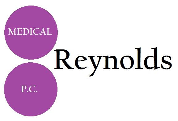
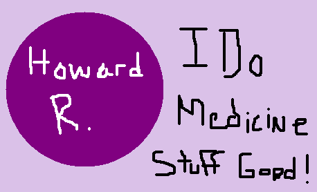
I think I like this layout, and shade of purple. It looks good in grey scale too. I have no clue on the font. Every one I try out looks fine.
Can you guys abide just a little bit of gradient?
Who knows? Maybe, you were kidnapped, tied up, taken away and held for ransom.Those days are gone forever
Shirley
The Dude
Posts: 7723 Joined: Mon Mar 11, 2013 2:32 pm
Post
by Shirley Sat Mar 30, 2013 9:19 am
I think the gradient is ok. The spacing is off though and the circle is a bit pixelated. Seriously man, get a pro to put this together for you. I can tell by looking at those that they were not professionally done.
Totally Kafkaesque
Sabo
The Dude
Posts: 5477 Joined: Mon Mar 11, 2013 8:33 amLocation: On the trail
Post
by Sabo Sat Mar 30, 2013 9:58 am
Shirley wrote: Seriously man, get a pro to put this together for you. I can tell by looking at those that they were not professionally done.
I agree with this statement.
By the way, have I mentioned my wife is a freelance graphic designer?
THERE’S NOWT WRONG WITH GALA LUNCHEONS, LAD!
mister d
The Dude
Posts: 29491 Joined: Tue Mar 12, 2013 8:15 am
Post
by mister d Sat Mar 30, 2013 10:53 am
I think it should be a needle with "Reynolds Medical" inside and underneath, in purple if you like, you should have the slogan "I Get In Ya".
Johnnie wrote: ↑ Sat Sep 10, 2022 8:13 pm Oh shit, you just reminded me about toilet paper.
HaulCitgo
Walter Sobchak
Posts: 4617 Joined: Wed Mar 20, 2013 3:07 pm
Post
by HaulCitgo Sat Mar 30, 2013 12:15 pm
Circle with no gradient, but agreed. Hire someone. Seems like a guy recently got someone from eastern Europe on one of those bid sites and they did a solid job for im sure less than $100.
ZMan
Brandt
Posts: 351 Joined: Mon Mar 11, 2013 8:47 amLocation: On my ship, the Rocinante
Post
by ZMan Sun Mar 31, 2013 4:16 am
The color should be darker, and it should be in the shape of a bass guitar.
Orange Whip? Orange Whip? Three Orange Whips!
FredRomero
Post
by FredRomero Sun Mar 31, 2013 7:32 am
I decided to go with the circle and changed the color from purple to red. I'll mail you the bill.
testuser2
Brandt
Posts: 495 Joined: Mon Mar 11, 2013 11:53 am
Post
by testuser2 Mon Apr 01, 2013 9:40 am
Of course the logo is purple. I'd expect nothing less from Howard.
The Sybian
The Dude
Posts: 19108 Joined: Tue Mar 19, 2013 10:36 amLocation: Working in the Crap Part of Jersey
Post
by The Sybian Mon Apr 01, 2013 9:46 am
FredRomero wrote: I decided to go with the circle and changed the color from purple to red. I'll mail you the bill.
Winner!
An honest to God cult of personality - formed around a failed steak salesman.
Ryan
The Dude
Posts: 10546 Joined: Mon Mar 18, 2013 10:01 am
Post
by Ryan Mon Apr 01, 2013 9:57 am
he’s a fixbking cyborg or some shit. The
rass
The Dude
Posts: 20467 Joined: Mon Mar 18, 2013 9:41 amLocation: N effin' J
Post
by rass Mon Apr 01, 2013 10:02 am
Well, doesn't Syb just look like an ass right about now.
I felt aswirl with warm secretions.
Gunpowder
The Dude
Posts: 8587 Joined: Mon Mar 11, 2013 7:52 amLocation: Dipshitville, FL
Contact:
Post
by Gunpowder Mon Apr 01, 2013 11:24 am
Doug...come on. You can't use this as a logo. It looks like Clip-Art.
Pack a vest for your james in the city of intercourse
A_B
The Dude
Posts: 23591 Joined: Mon Mar 11, 2013 7:36 amLocation: Getting them boards like a wolf in the chicken pen.
Post
by A_B Mon Apr 01, 2013 11:25 am
Grasspenis wrote: Doug...come on. You can't use this as a logo. It looks like Clip-Art.
Not only that but it is probably not very scalable for when you buy your full-page ad in the NYT.
Hold on, I'm trying to see if Jack London ever gets this fire built or not.
howard
Karl Hungus
Posts: 9467 Joined: Mon Mar 18, 2013 12:00 pm
Post
by howard Mon Apr 01, 2013 11:29 am
Y'all never fail. TWILTS
Who knows? Maybe, you were kidnapped, tied up, taken away and held for ransom.Those days are gone forever
mister d
The Dude
Posts: 29491 Joined: Tue Mar 12, 2013 8:15 am
Post
by mister d Mon Apr 01, 2013 11:44 am
Johnnie wrote: ↑ Sat Sep 10, 2022 8:13 pm Oh shit, you just reminded me about toilet paper.
rass
The Dude
Posts: 20467 Joined: Mon Mar 18, 2013 9:41 amLocation: N effin' J
Post
by rass Mon Apr 01, 2013 11:52 am
mister d wrote:
I thought you might have gone with something like this:
I felt aswirl with warm secretions.
Gunpowder
The Dude
Posts: 8587 Joined: Mon Mar 11, 2013 7:52 amLocation: Dipshitville, FL
Contact:
Post
by Gunpowder Mon Apr 01, 2013 12:01 pm
I was totally going to do that, actually.
Pack a vest for your james in the city of intercourse
howard
Karl Hungus
Posts: 9467 Joined: Mon Mar 18, 2013 12:00 pm
Post
by howard Mon Apr 01, 2013 2:06 pm
Hey ryan~
Who knows? Maybe, you were kidnapped, tied up, taken away and held for ransom.Those days are gone forever
Ryan
The Dude
Posts: 10546 Joined: Mon Mar 18, 2013 10:01 am
Post
by Ryan Mon Apr 01, 2013 2:34 pm
Patua One
he’s a fixbking cyborg or some shit. The
howard
Karl Hungus
Posts: 9467 Joined: Mon Mar 18, 2013 12:00 pm
Post
by howard Mon Apr 01, 2013 3:13 pm
Thanks
Who knows? Maybe, you were kidnapped, tied up, taken away and held for ransom.Those days are gone forever